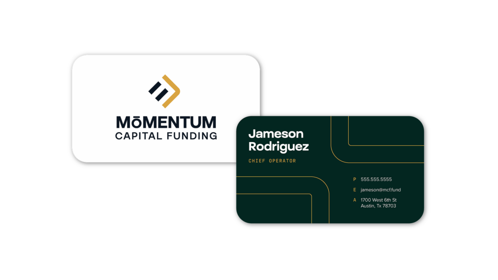
Mōmentum Capital Funding
Brand Guide
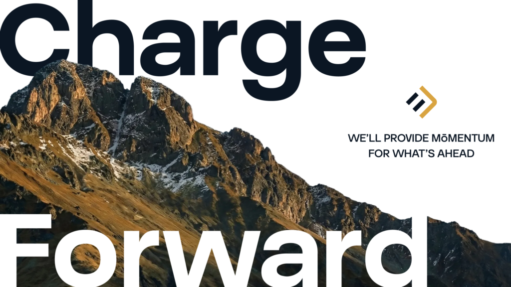
Charge Forward With Mōmentum
The core of our brand
Our Logo Suite

Primary Mark
The Primary Mark should be on all official collateral when space allows. Use the vertical and horizontal variations as needed. Only set it in the following approved colorways. The black colorway is only to be used on brand partnership collateral when required by brand partners.

Primary Mark Vertical Two Color Navy

Primary Mark Vertical Two Color White

Primary Mark Vertical One Color Navy

Primary Mark Vertical One Color White

Primary Mark Vertical One Color Black

Primary Mark Horizontal Two Color Navy

Primary Mark Horizontal Two Color White

Primary Mark Horizontal One Color Navy

Primary Mark Horizontal One Color White

Primary Mark Horizontal One Color Black


Icon

Icon Mark
Our Icon Mark is a broken down piece of the primary mark. Utilize this mark when space doesn't allow for either the Primary Logo or the Word Mark. It may be used on applications such as social media posts and merchandise. Set it in the following approved colorways. The black colorway is only to be used on brand partnership collateral when required by brand partners.

Icon Mark Two Color Navy

Icon Mark Two Color White

Icon Mark One Color Navy

Icon Mark One Color White

Icon Mark One Color Black
our logo
Usage

Safe Space
When displaying any of the logo variations, maintain ample space around it to avoid crowding or interference from other elements. To achieve this, don’t place anything within the “safe space” equivalent to 10% the width of the logo.
*Of course, there are exceptions: subtle patterns or textures overlapping at 20% opacity or less are acceptable.
Please Don't

Use unapproved color combinations or colors

Distort the logo and elements

Mask images into the logo

Place on backgrounds that make elements hard to read

Use alt fonts
Mōmentum in
Color
Primary Colors
Blizzard White
- Hex #FFFFFF
- RGB 255, 255, 255
- CMYK 0, 0, 0, 0
- Pantone White
West Texas Sky Black
- Hex #0B1623
- RGB 11, 22, 35
- CMYK 86, 75, 57, 73
- Pantone Black 6 C
High Plains Pine
- Hex #032620
- RGB 3, 38, 32
- CMYK 85, 57, 70, 73
- Pantone 5463 C
Secondary Colors
Our Secondary Color is used to accent our logo and add texture when necessary on key graphics.
Panhandle Prarie
- Hex #D9A441
- RGB 217, 164, 65
- CMYK 15, 36, 88, 0
- Pantone 4025 C
Typography
Our Font Families
Subheadings & Buttons - Antarctican Mono Medium
ABCDEFGHIJKLMNOPQRSTUVWXYZ1234567890!@#$%^&
Headings - Volda Sans Semibold
Aa Bb Cc Dd Ee Ff Gg Hh Ii Jj Kk Ll Mm Nn Oo Pp Qq Rr Ss Tt Uu Vv Ww Xx Yy Zz
1234567890!@#$%^&
Body - Volda Sans Regular
Aa Bb Cc Dd Ee Ff Gg Hh Ii Jj Kk Ll Mm Nn Oo Pp
Qq Rr Ss Tt Uu Vv Ww Xx Yy Zz 1234567890!@#$%^&
depth through
Design Elements
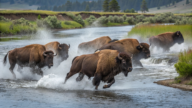

Brand in action
Application